
Zoom-Feature mit Tailwind— Veröffentlicht am
Veröffentlicht am
Zoom-Feature mit Tailwind
Eine einfache Zoom-Funktion für bessere Accessibility durch Tailwind @custom-variant
Einfach unkomplizierte Tooltips. Kinderleicht zu integrieren und zu konfigurieren. CSS-first und accessibility mitgedacht.
npm i @aersosi/a11ytip@import "@aersosi/a11ytip/css";import { toggleA11ytip } from "@aersosi/a11ytip/js";
document.addEventListener("DOMContentLoaded", toggleA11ytip);Einfachstes Beispiel:
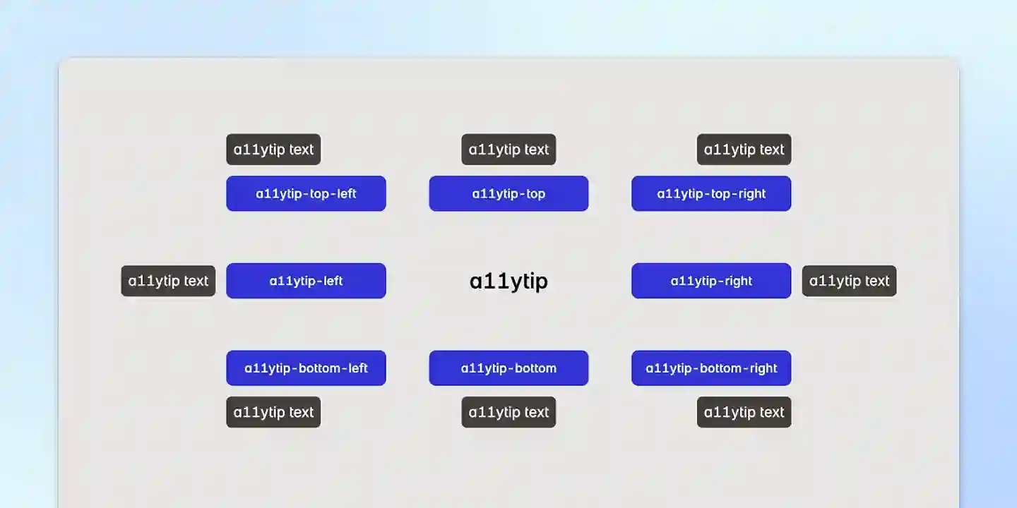
<button data-a11ytip-top aria-label="Hover mich">Hover mich</button><button data-a11ytip-top aria-label="Ich erscheine oben!">Hover mich</button>
<button data-a11ytip-top-left aria-label="Ich bin oben links ausgerichtet!">Hover mich</button>
<button data-a11ytip-top-right aria-label="Ich bin oben rechts ausgerichtet!">Hover mich</button>
<button data-a11ytip-right aria-label="Ich erscheine rechts!">Hover mich</button>
<button data-a11ytip-right-top aria-label="Ich bin rechts oben ausgerichtet!">Hover mich</button>
<button data-a11ytip-right-bottom aria-label="Ich bin rechts unten ausgerichtet!">Hover mich</button>
<button data-a11ytip-bottom aria-label="Ich erscheine unten!">Hover mich</button>
<button data-a11ytip-bottom-left aria-label="Ich bin unten links ausgerichtet!">Hover mich</button>
<button data-a11ytip-bottom-right aria-label="Ich bin unten rechts ausgerichtet!">Hover mich</button>
<button data-a11ytip-left aria-label="Ich erscheine links!">Hover mich</button>
<button data-a11ytip-left-top aria-label="Ich bin links oben ausgerichtet!">Hover mich</button>
<button data-a11ytip-left-bottom aria-label="Ich bin links unten ausgerichtet!">Hover mich</button>aria-label definiert.data-a11ytip-text Attribut verwenden.aria-label und data-a11ytip-text, können gleichzeitig genutzt werden. In diesem Fall hat der
Text aus data-a11ytip-text Vorrang und wird angezeigt.Beispiel mit beiden Attributen:
<button data-a11ytip-top aria-label="Dialog-Fenster schließen" data-a11ytip-text="Dialog schließen">Schließen</button>Das data-a11ytip-text bestimmt den angezeigten a11ytip-Text (“Dialog schließen”), während das aria-label unabhängig
bleibt.
Durch Hinzufügen der .a11ytip-force-active Klasse an einer beliebigen Stelle im DOM (oberhalb eines a11ytip-Elements)
können Sie den aktiven Status aller a11ytip dauerhaft erzwingen.
Beispiel mit der .a11ytip-force-active:
<body class="a11ytip-force-active">
  <button data-a11ytip-top aria-label="Ich bin immer sichtbar!">Kein Hover nötig</button>
  <button data-a11ytip-bottom aria-label="Ich bin immer sichtbar!">Kein Hover nötig</button>
</body>
Mit dem data-a11ytip-force-active Attribut können Sie den aktiven Status eines einzelnen a11ytip dauerhaft erzwingen.
Beispiel mit Data-Attribut:
<button data-a11ytip-top data-a11ytip-force-active aria-label="Ich bin immer sichtbar!">Kein Hover nötig</button>Wenn Sie alle a11ytip auf Touch-Geräten ausblenden möchten, fügen Sie einfach die .a11ytip-no-touch Klasse an einer
Stelle im DOM oberhalb des a11ytip hinzu. Alle a11ytip werden auf Touch-Geräten ausgeblendet.
Beispiel:
<body class="a11ytip-no-touch">
  <button data-a11ytip-top aria-label="Ich bin auf Touch-Geräten nicht aktiv!">Hover mich</button>
</body>Standardkonfiguration:
/* src/a11ytip_config.css */

:root {
  /* Text */
  --a11ytip-text-size: 1rem;
  --a11ytip-text-color: white;

  /* Box */
  --a11ytip-bg-color: theme(color.base.700, black);
  --a11ytip-padding-left: 8px;
  --a11ytip-padding-right: 8px;
  --a11ytip-padding-top: 4px;
  --a11ytip-padding-bottom: 4px;
  --a11ytip-border-radius: 6px;
  --a11ytip-box-shadow: 0 1px 3px 0 theme(colors.black / 0.25), 0 1px 2px -1px theme(colors.black / 0.1);
  --a11ytip-max-width: 14ch;

  /* Animation */
  --a11ytip-start-position: calc(100% + 2px);
  --a11ytip-end-position: calc(100% + 8px);
  --a11ytip-transition-duration: 250ms;

  --a11ytip-z-index: 100;
}

/* Dark Theme */
[data-dark],
[data-theme="dark"],
:root.dark {
  --a11ytip-text-color: black;
  --a11ytip-bg-color: theme(color.base.100, white);
}
Tailwind Konfigurationsbeispiel:
/* src/a11ytip_config.css */

:root {
   /* Text */
   --a11ytip-text-size: theme(fontSize.sm, 0.875rem);
   --a11ytip-text-color: theme(colors.white, #ffffff);

   /* Box */
   --a11ytip-padding-left: theme(spacing.2, 0.5rem);
   --a11ytip-padding-right: theme(spacing.2, 0.5rem);
   --a11ytip-padding-top: theme(spacing.1, 0.25rem);
   --a11ytip-padding-bottom: theme(spacing.1, 0.25rem);
   --a11ytip-box-shadow: theme(boxShadow.sm, 0 1px 2px 0 rgb(0 0 0 / 0.05));

   ...
}Das Dark Theme wird in folgenden Fällen getriggert:
data-dark Attribut: <body data-dark>data-theme="dark" Attribut: <body data-theme="dark">.dark Klasse: <body class="dark">Sie können auch eigene Themes erstellen, indem Sie neue Selektoren in der a11ytip_config.css definieren.
Zum Beispiel:
/* Pinkes Theme */

[data-theme="pink"] {
  --a11ytip-text-color: white;
  --a11ytip-bg-color: darkmagenta;
}Die CSS-a11ytip unterstützen optionale data-* Attribute, mit denen Sie die Standardkonfiguration für ein einzelnes
a11ytip überschreiben können.
Hinweis: Die Anpassung über Data-Attribute wird derzeit nur in Chrome-basierten Browsern unterstützt.
Verfügbare Data-Attribute:
data-a11ytip-*:
data-a11ytip-top (zentriert)data-a11ytip-top-leftdata-a11ytip-top-rightdata-a11ytip-right (zentriert)data-a11ytip-right-topdata-a11ytip-right-bottomdata-a11ytip-bottom (zentriert)data-a11ytip-bottom-leftdata-a11ytip-bottom-rightdata-a11ytip-left (zentriert)data-a11ytip-left-topdata-a11ytip-left-bottomdata-a11ytip-text:
aria-label, wenn beide vorhanden sind.data-a11ytip-text-size:
<Zahl> gefolgt von einer Einheit (z.B. 16px, 1rem).data-a11ytip-text-color:
<color> Wert (z.B. #ffffff, rgb(255, 255, 255) oder blue).data-a11ytip-bg-color:
<color> Wert.data-a11ytip-padding-left, data-a11ytip-padding-right, data-a11ytip-padding-top und
data-a11ytip-padding-bottom:
<length> Wert (z.B. 0.5rem, 8px).data-a11ytip-border-radius:
<length> Wert (z.B. 0.375rem, 5px).data-a11ytip-box-shadow:
box-shadow Wert (z.B. 0 4px 6px rgba(0, 0, 0, 0.1), none).data-a11ytip-max-width:
<length> Wert (z.B. 14ch, 150px).data-a11ytip-start-position und data-a11ytip-end-position:
start) und endpunkt (end).<length> Werte (z.B. 4px, 2rem).data-a11ytip-transition-duration:
350ms, 0.5s).data-a11ytip-delay:
250, 1000).500 (500 Millisekunden).data-a11ytip-force-active:
data-a11ytip-z-index:
100, 999, 1000).100.Beispiel mit allen verfügbaren Data-Attributen:
<button
  data-a11ytip-top
  aria-label="Ich bin ein freches a11ytip!"
  data-a11ytip-text="Dieser Text wird angezeigt"
  data-a11ytip-force-active
  data-a11ytip-text-size="2rem"
  data-a11ytip-text-color="hotpink"
  data-a11ytip-bg-color="#1a1a1a"
  data-a11ytip-padding-left="1rem"
  data-a11ytip-padding-right="1rem"
  data-a11ytip-padding-top="0.8rem"
  data-a11ytip-padding-bottom="0.8rem"
  data-a11ytip-border-radius="1rem"
  data-a11ytip-box-shadow="0 10px 25px rgba(0, 0, 0, 0.2)"
  data-a11ytip-max-width="20ch"
  data-a11ytip-start-position="4px"
  data-a11ytip-end-position="12px"
  data-a11ytip-transition-duration="200ms"
  data-a11ytip-delay="1000"
  data-a11ytip-z-index="999"
>
  Hover mich
</button>
Vielen Dank und viel Freude mit a11ytip!